

PS1 Brief
PS1 Brief
MoMa PS1: Companion App
Space limitations and aesthetic intentions of the museum experience can restrict visitor access to a sufficient amount of information. Mobile technology has the ability to compliment the PS1 visitor experience through enhanced interaction, education, and way-finding. The following research shows the extent and variety of possible opportunities and proposes a service design solution. The purpose of our research is to identify the PS1 visitor, understand how visitors currently use their mobile devices within art museums and how their motivations and behaviors affect their experiences. The resulting iOS companion app design could satisfy the goals of both the Museum of Modern Art PS1 and its visitors.

PS1 Case Study
Full Case Study
PS1 Case Study
Full Case Study
Business Goals
We met with Alejandro Cercas, the Senior Visitor Engagement Associate at PS1 to discuss his goals involving increased visitor engagement with a mobile app. He states the need for the PS1 app to be different from MoMa’s.
“We are contemporary art. We are not mainstream. For example our Summer shows consist of experimental 'Noise Art' - its obviously very popular and appeals to a wide audience, but its not going to be mainstream.”
Cercas is concerned that the curators would not be able to easily update exhibit information in the app, considering exhibits rotate at least every 8-10 months and the long term-collection is very small. The curatorial director places a high level of importance on a minimalist aesthetic in the gallery - this leads to very minimal wall text, and less educational materials (even the lobby must be minimal). The exhibition at the time of this research, Greater New York, has over 150 participating artists. It is impossible to present much information for each piece in the small exhibit hall, but visitors always want to know more.
A significant proportion of PS1 visitors are foreign tourists, whom often request materials in foreign languages (Spanish, French, German, Chinese, Korean, Japanese) which the museum currently does not offer. A significant portion of the current budget must be allocated to printing maps and pamphlets (approx. 20,000 maps a month). The museum feels this is both economically and environmentally wasteful. They would like to include a digital map in the app as a solution.
Key Takeaways:
Embrace the PS1 minimalist branding and differentiate it from MoMa
Provide the breadth of information visitors need, which the physical space cannot support
Build a back-end CMS so that curators can easily update content
Provide translation options
Implement a digital map
Competitive Landscape
“…digital [is] being naturalized within museums’ visions and articulations of themselves”
- Ross Parry, “The End of the Beginning: Normativity in the Post-digital Museum”, in Museum Worlds: Advances in Research, 2013
Competitive Museum Apps: Palais de Tokyo, Cooper Hewitt, Gugenheim, Stedelijk, Art Institute of Chicago, Met, MoMa, Whitney, Brooklyn Museum
Comparative Products: Museum of Natural History, Artsy App, Art Forum, Wikipedia
PS1 is competing with museums in New York City, as well as contemporary art museums worldwide. Each of the competitive museums offer companion apps. Thus, visitors who are familiar with PS1 competitors will also expect to find a companion app at PS1. We conducted a feature analysis to determine which features populate the competitive space. Most of the competitors offer a digital map, some of which are dynamic. All include general museum information. Many include a way for visitors to save, collect, or ‘favorite’ pieces. The audio tours offered are usually very short and equivalent to the tours offered on traditional handsets - a gap in the market (we discovered users desired a variety of tours catered to their particular interests). Most competitors gave info about individual pieces, some of which could be accessed individually by entering a number.
During our contextual inquiry at the Brooklyn Museum, we found the beauty in creating something that solved for the distilled problem of what people really want: Simply being able to ask a curator a question whenever and wherever they want. We also found that the intimate connection to a real person felt more accessible. The American Museum of Natural History app tour did not offer audio and has less information than what was already offered on the wall text. Users found this disappointing and not very useful.
FEATURES TO INCLUDE:
Map
General museum information
Collections
Favorites
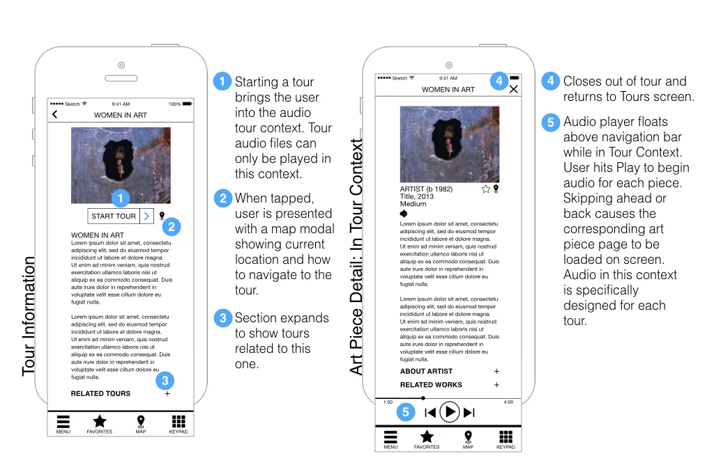
Audio tours
Piece by piece Information
Common vernacular
Technical Research
Possibilities & Limitations of the Native App
A native app will allow visitors to access content without worrying about the inconsistent wifi. PS1 is housed in an old school building, and although wifi is provided in the lobby, the concrete walls cause inconsistent location services and network connections. A native app will also allow our services to connect with the visitor’s bluetooth, which will help us to give the visitor directions, orient them to their location, and suggest nearby tours. However, during our contextual visit to American Museum of Natural History, we found that bluetooth navigation is not incredibly precise, and so we will not be able to determine which individual piece the visitor is viewing just by their location. Instead, the user will have to type in a corresponding number.
PS1 will eventually need to create an app for multiple operating systems, and a native app will take much longer to develop than a responsive site. The app is limited to 100 MB in the App Store and Google Play, which means we may need additional content (such as the audio tours) downloaded once app is opened for the first time.
Further Recommendations
PS1 will need to advertise its free wifi in the lobby so that visitors understand that they do not need to use their own data to download the app (as we determined this was a deterrer). Although the app will be hosted on each visitor’s individual device, PS1 should consider supporting the experience by offering a phone charging station, headphones to rent, and possibly even extra iPhones. The museum will need to install Bluetooth beacons throughout the museum, one for every 2-3 sq. foot.
KEY TAKEAWAYS
Native app platform
Free Wifi
Bluetooth location is only room accurate
Downloaded content
Bluetooth beacons
Headphones and charging station
iOS DESIGN STANDARDS
Navigation bar
Modal contexts
Tab bar
Designed for one orientation
Unobtrusive brand assets
Accessing location services
User Interviews
Following the initial business and competitive research, screeners were sent out to find interviewees. 12 people were selected based on their screener responses so we could gain insights into their museum expectations, frustrations, visiting habits, etc. It was important to talk to museum visitors that considered themselves well educated in art and also those who did not.
Key Takeaways
Museum visitors use their smartphones to look up supplemental information on artists or works they want to know more about
About half do not further investigate information on mobile while at the museum, instead opting to bookmark a source so they can read about a certain subject after leaving
Visitors interested in taking a museum tour want more control over what that tour entails (info as a linear story vs. a curated sampling of works they can view in any order)
People can get lost or turned around even when they have maps, because it can be hard for visitors to locate themselves on something static and printed
Personas
Using affinity mapping, personas were developed. User stories and job stories were also created. Originally, we had three different personas, but as we continued to investigate our target users, we found that only two were necessary.
User Story:
As someone without an art background, I want to understand more about the piece I'm viewing so I can appreciate them more.
Since I am a curious person, I'd like to have access to related artists so I can discover more art that I like
Job Story:
When I'm curious about a piece but running short on time, I want to be able to save it, so that I can research it more in depth at my convenience,
When I first walk into a museum I feel overwhelmed and out of place. I want to be led around the museum by a friendly guide who speaks my language, so that I feel more comfortable and in the loop.
When I'm at the museum and don't know where to start, I want to be able to browse different galleries and exhibitions on offer at the museum, so that I can plan my visit.
User Story:
Because I'm an artist, I want to easily locate my favorite pieces to study the technique used.
As an art professional, I want to have information at my fingertips so that I can easily find the answers to my specific questions
Job Story:
When I want to visit a specific piece, I need to search for it my name and see a map that tells me where I am in relation to the piece, so that I can easily find my way without getting lost.
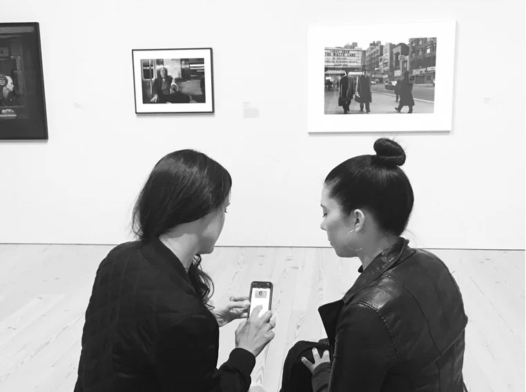
When I'm standing in front of a piece and want to learn more about it, I want to easily and quickly access information about it, so that I don't have to take my eyes off the piece and elbow my way to the wall text.
Feature Prioritization
Once the personas were created, the Moscow Method was used to do a feature prioritization. Based on our research, it was necessary to include museum maps, a way for visitors to enter an art work into the application for more information, and a way to present the information for each work. Other features we felt should be added based on user needs were audio tours, a way to favorite or bookmark a piece to access information later, and Bluetooth location services. Since the art was still the main focus, it was necessary that we allowed users to gain information while having a "heads up" experience whenever possible. Essentially, we realized it would not be to the benefit of a museum visitor to have to keep his or her eyes glued to the phone, so interactions should be quick and we should offer audio when possible.
User Flows
After working through the feature list and determining preliminary functions, user flows were created for the most important interactions. Once the flows started to develop, screen designs started to fall into place.
Wireframes
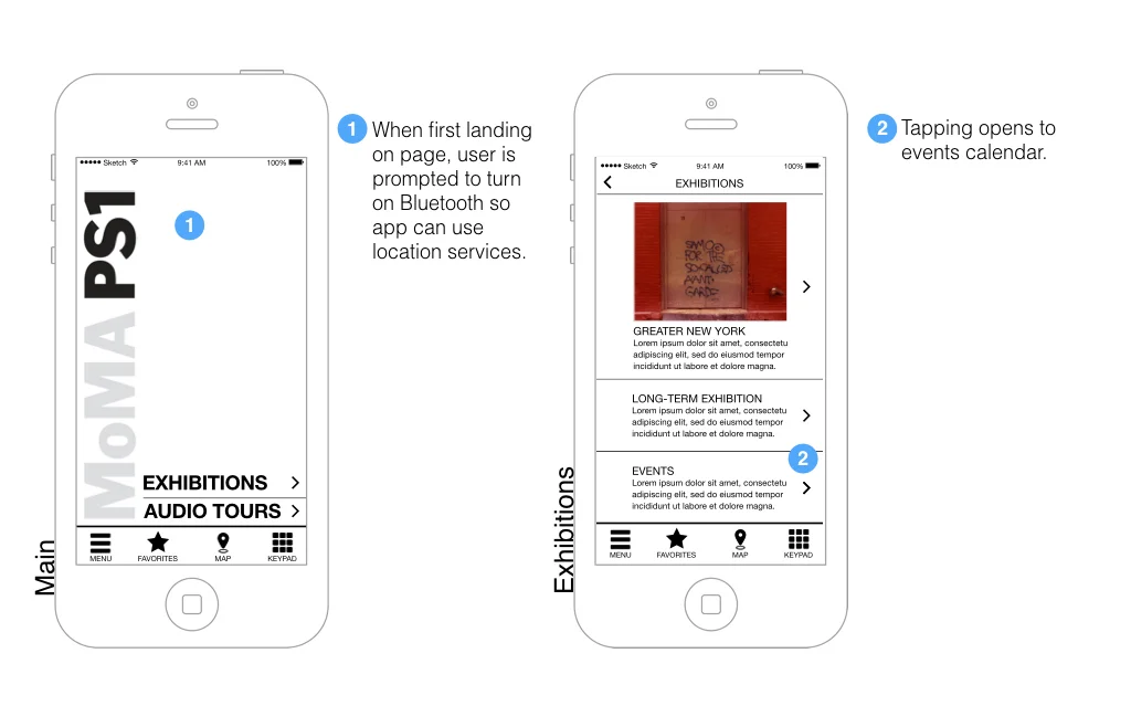
Considering the elements and features we needed, we developed screens for exhibition and tour information, along with screens for each piece of artwork. A map screen was included, as were screens for favoriting pieces, entering an artwork's corresponding wall number, and for search. An audio option was included for informational text associated with each piece.
Prototype & Testing
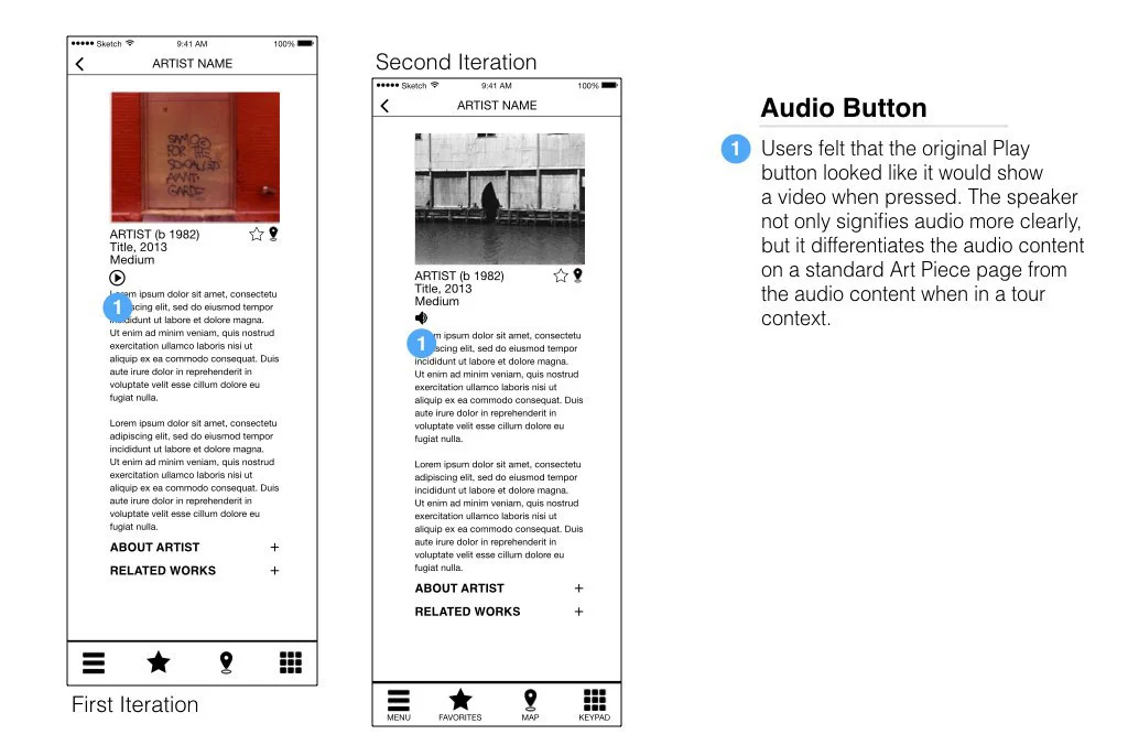
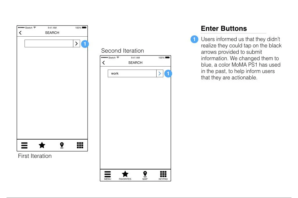
A prototype was built once we had our screen layouts and flows, and then user testing began. We would end up only having time to create two iterations of the prototype for testing, but the information we received from testers was extremely valuable. We came to understand that we needed to label the icons, change some of the microcopy, and insert modals for certain flows.


