

Curate Brief
Curate Brief
Curate: Men's Styling App
Role
UX/UI Designer
Format
Mobile app
Tools
SKETCH, PHOTOSHOP
Client
Curate
Curate is a styling app for men who want to look as good as possible while spending little time and effort putting together outfits. They want help styling, archiving, and building a well-rounded wardrobe tailored to their body types and preferences. Curate was brought to us in its early design stages without existing users or data to reference, so we began by validating its user base. The scope included conceptualizing in-app purchasing, and exploring a redesign of on-boarding, the wardrobe builder, and user settings. I worked as a UX designer on a team of three over a period of three weeks.
Onboarding
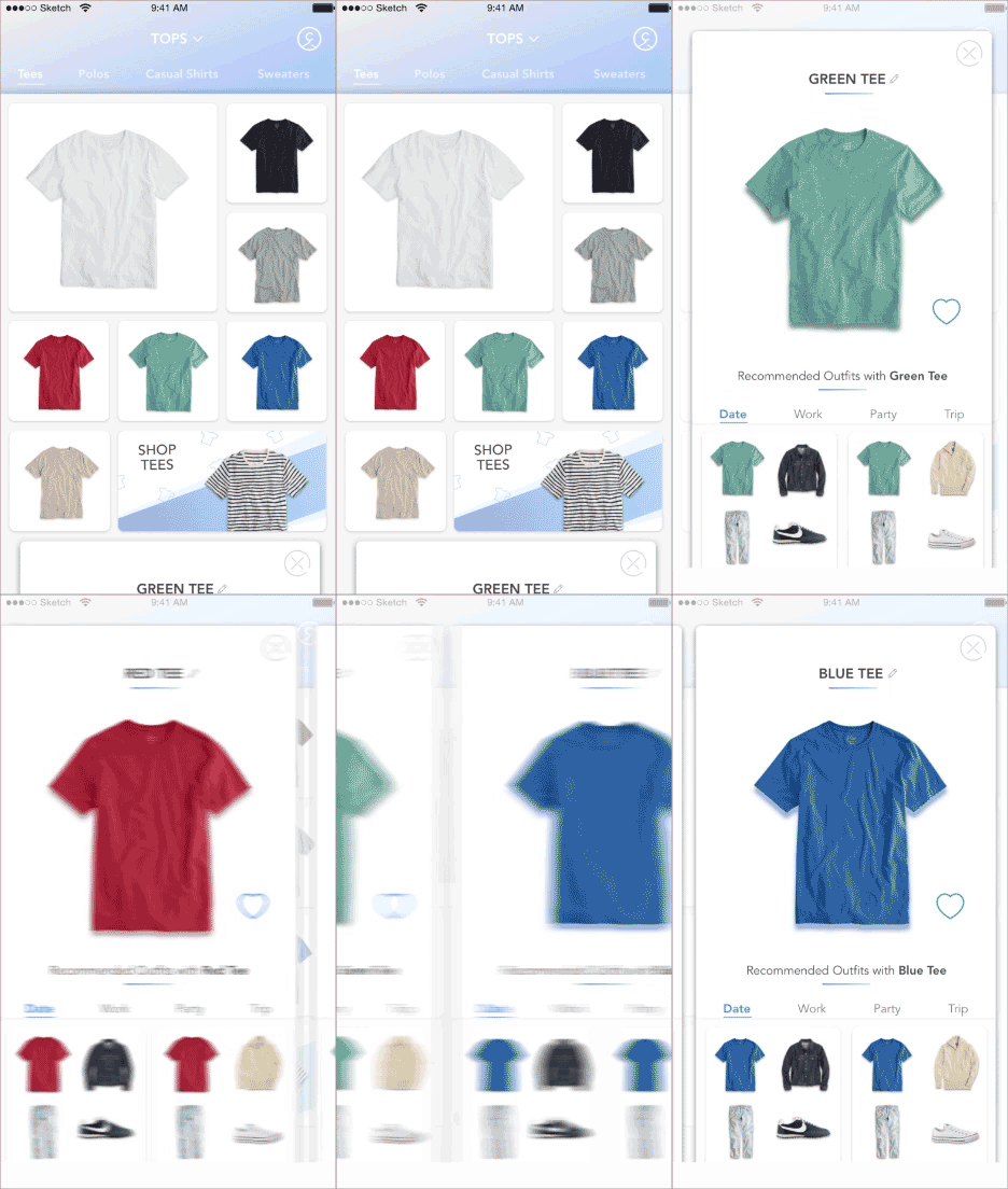
Curate Introduction, creating a style and size profile, wardrobe archiving
Outfit Building
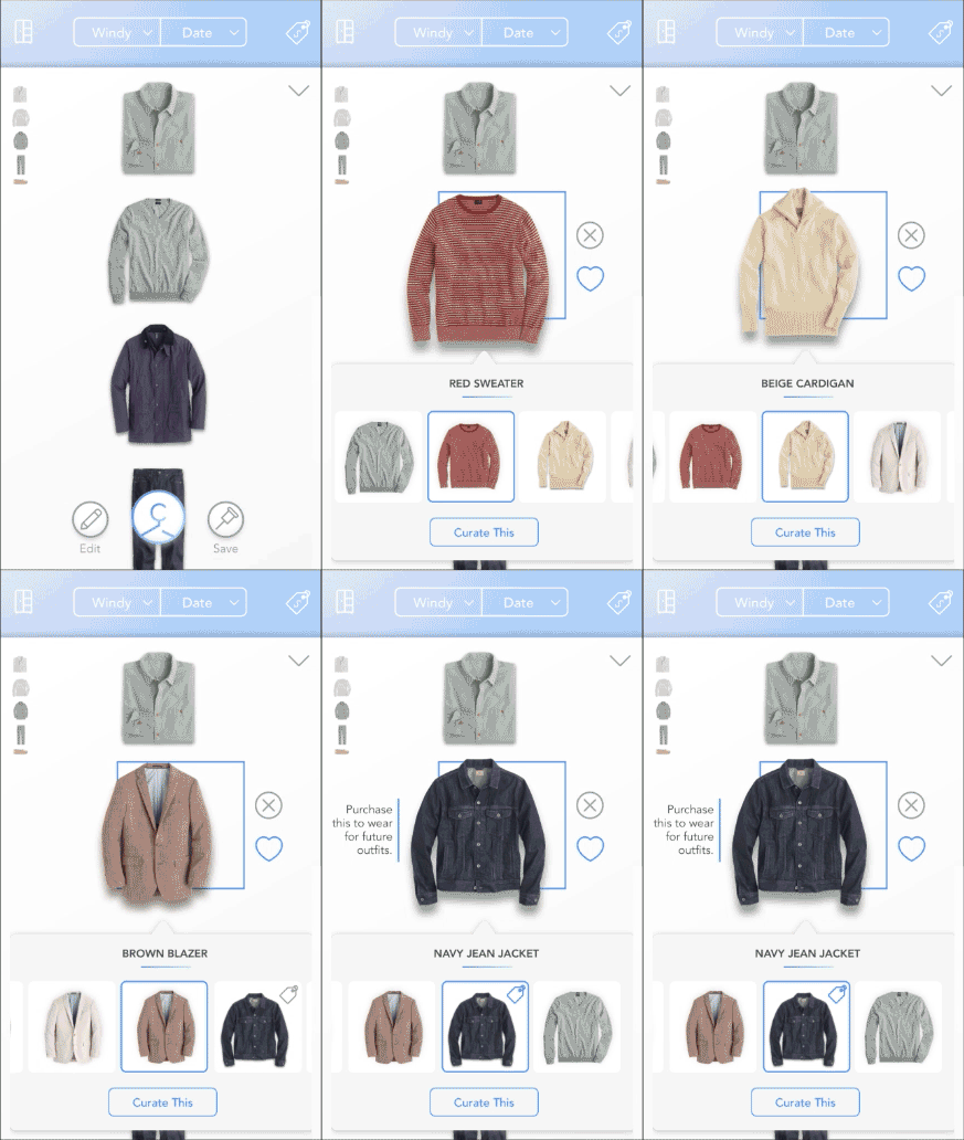
The user is able to build an outfit for a chosen activity centered around one piece in their wardrobe.
Contextual Shopping
Ability to add a missing wardrobe piece to complete an outfit through in-app purchasing

Curate Case Study
Full Case study
Curate Case Study
Full Case study
Product Evaluation
Contextual Inquiry, Journey Mapping, Heuristic Analysis
The initial research began by evaluating the current app in detail. Our team developed a journey map to illustrate the user's thoughts and emotions throughout the on-boarding and wardrobe building processes in order to identify its weak points and discover new opportunities. We found that the emotional curve of our user is the most positive upon opening the app. As the user continues the discovery phase, their expectations are not met, leading to increased levels of frustration, confusion and dissatisfaction.
Researching the Competition
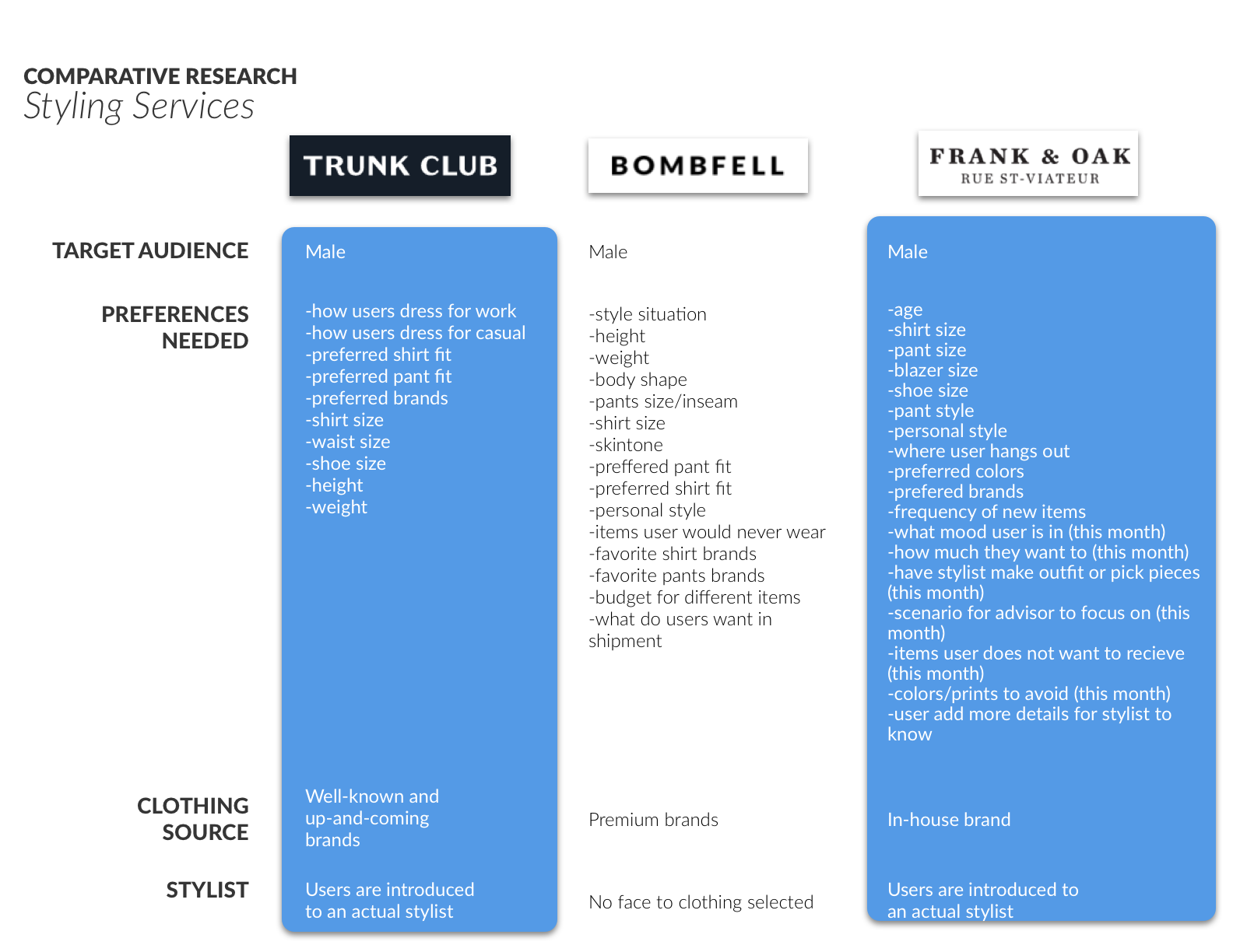
There are a number of services for wardrobe archiving, styling, and discovery, so how is Curate different? Why are we building it? Competitive and comparative research revealed a gap in the market for platforms to connect those three features all in one place. There is an opportunity to unify and simplify the experience.
KEy findings:
Fashion discovery platforms show how to find looks based on what the user currently owns. They have the ability to style existing items the user owns with new things to buy.
While clothing archiving platforms allow the user to differentiate items with hashtags, the overall job of garment inventory logging is tedious.
Styling services have long, detailed on-boarding and more or less cater to the same demographic.
User Research
User Surveys, User Interviews
Who is going to use Curate? We surveyed 86 males to better understand the shopping and styling habits of our user base. From those respondents, we interviewed 12 men, ranging in age from early 20s to late 30s, all of whom had a wide range of personal style, fashion-consciousness, and shopping behavior.
Key findings
Most men care more about price, fit, and style over the brand.
Men are conscious about repeating outfits too often, but at the same time have their "go-to" looks.
Overall, they dress first for the activity and the weather, and for their their mood.
Everyone defines their style differently.
Defining Our User
AFFINITY MAPPING, PERSONAS AND USER STORIES
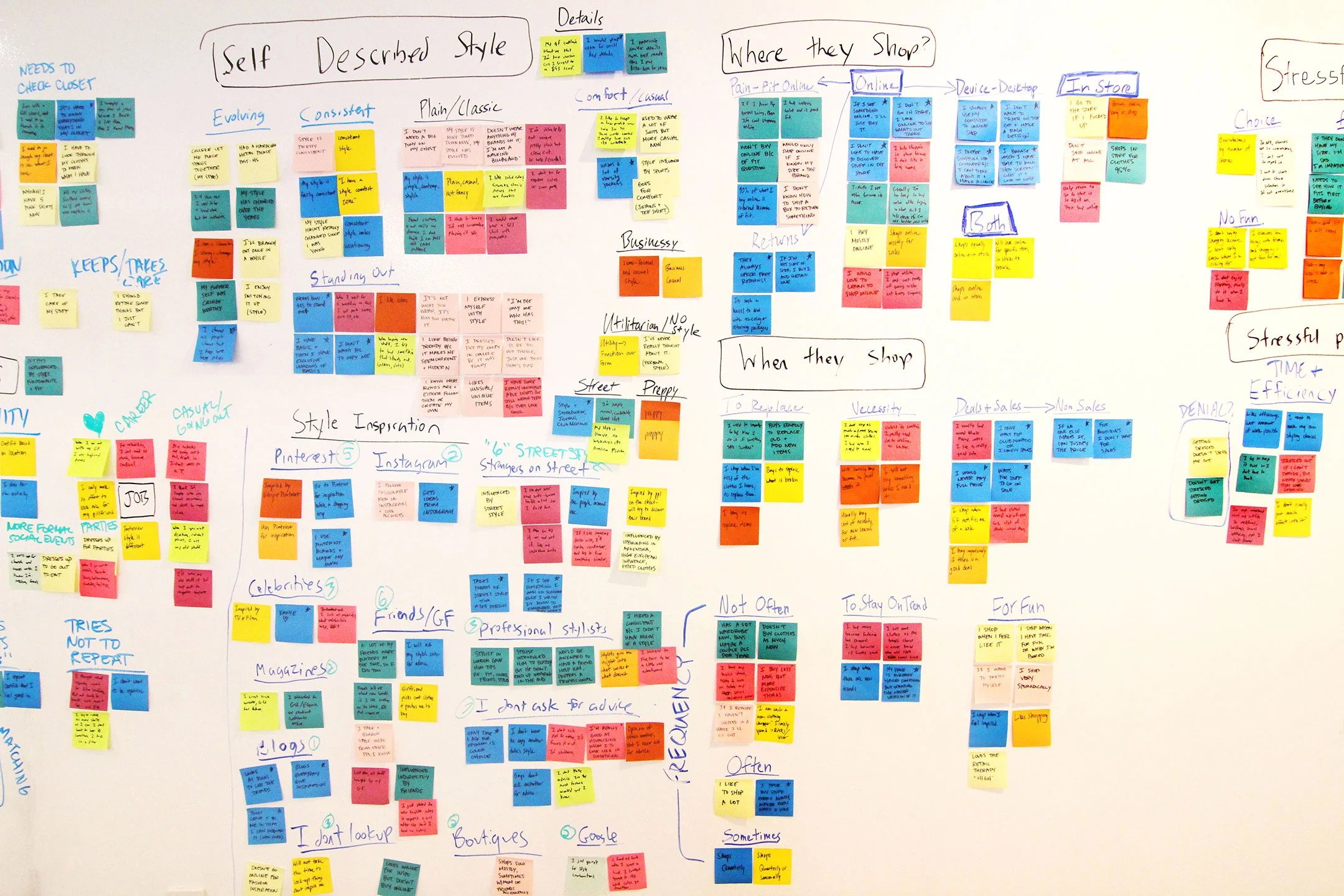
We synthesized all of our data from user interviews through affinity mapping. We discovered that we could organize our user's needs into two distinct groups. It was important to remember that we were designing for real people, so we created characters based on these groups; The Average Joe who needed help discovering clothing and putting together outfits, and The Stylish Guy who wanted a tool for archiving his wardrobe and favorite outfits. We then created a series of stories for each user, based on his individual needs. This would inform our feature prioritization and design strategy.
Brand Design
I felt that the brand identity could be improved to match the target demographic, starting with the logo. The bowtie did not resonate with most of the users as they did not own a bowtie, nor could they ever imagine wearing one. One thing that all of our users could relate to was the symbol of a clothes hanger. This inspired the redesigned logo. I also created a style guide for the app based on our brand mood boards.
Defining Style; Information Architecture
Card Sorting
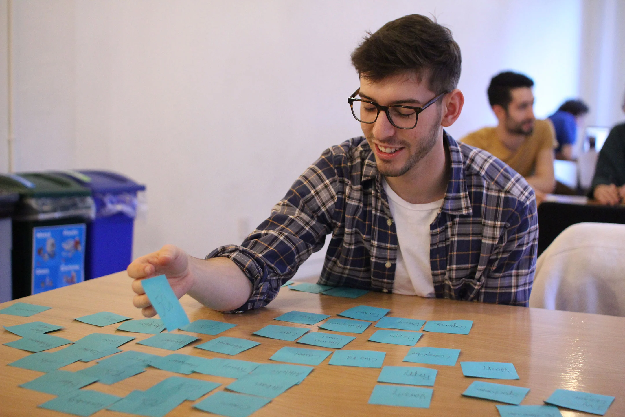
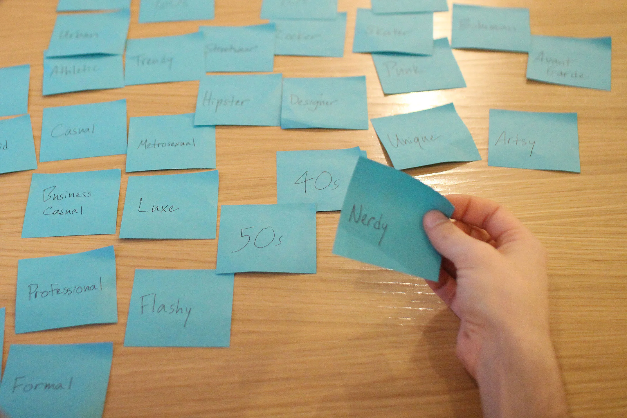
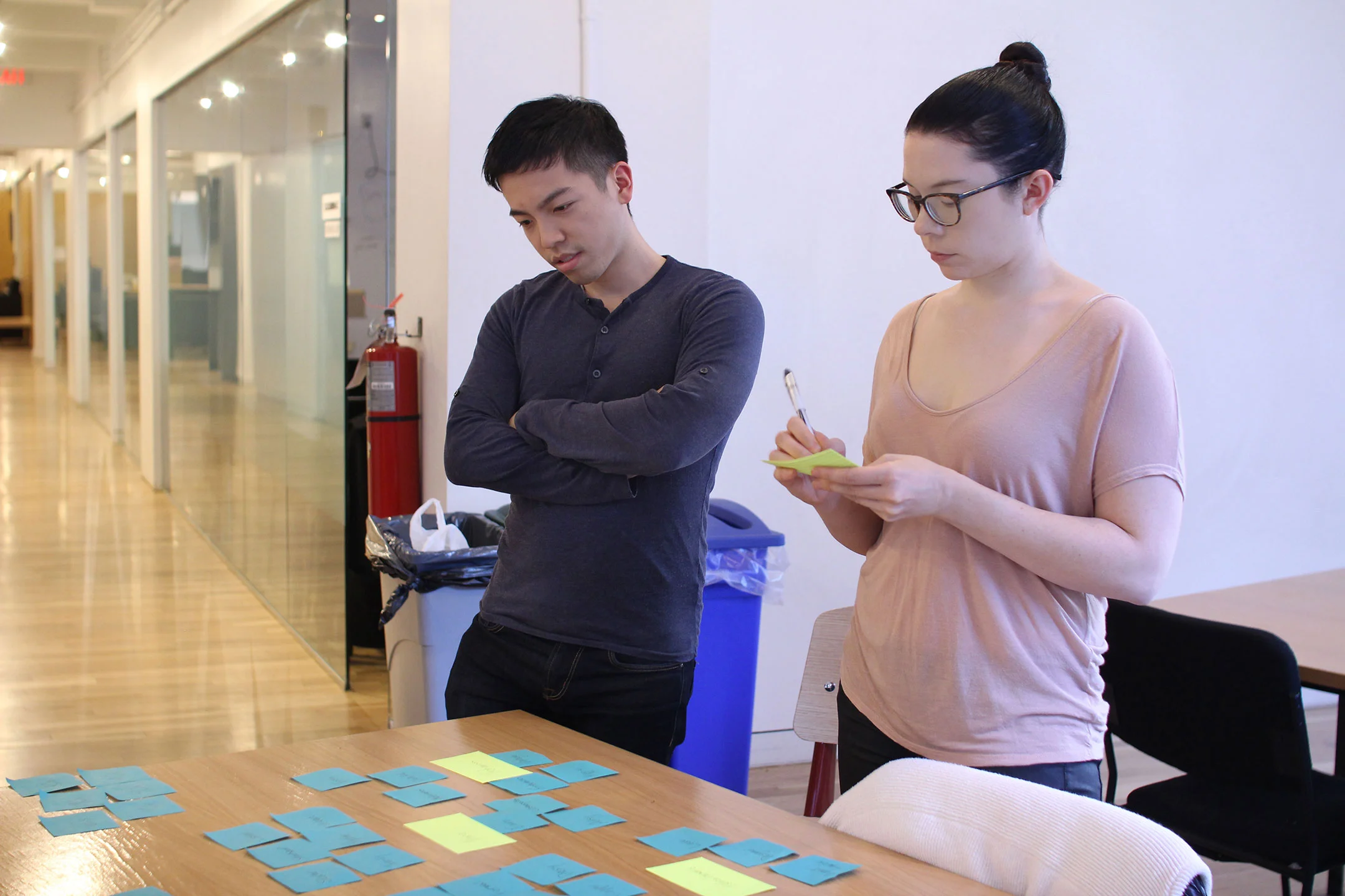
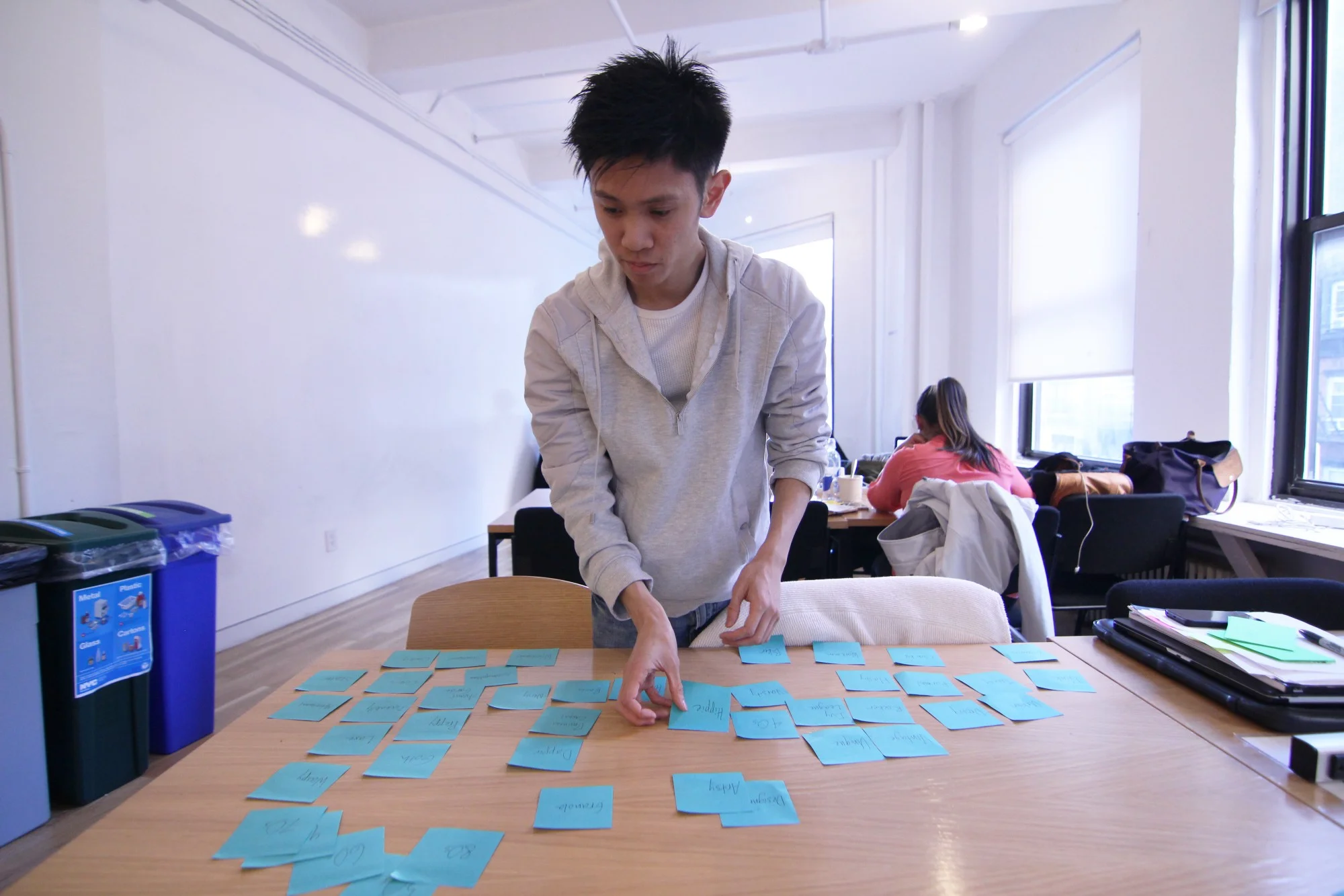
We knew it was important to cater personalized outfit recommendations to each user, so we planned to ask him to define his style during on-boarding. However, while talking to our users, we noticed that they each used different terms to define their styles. We conducted an open card sorting of over 100 terms to clarify how our users typically might associate them into more general categories.
A/B Testing
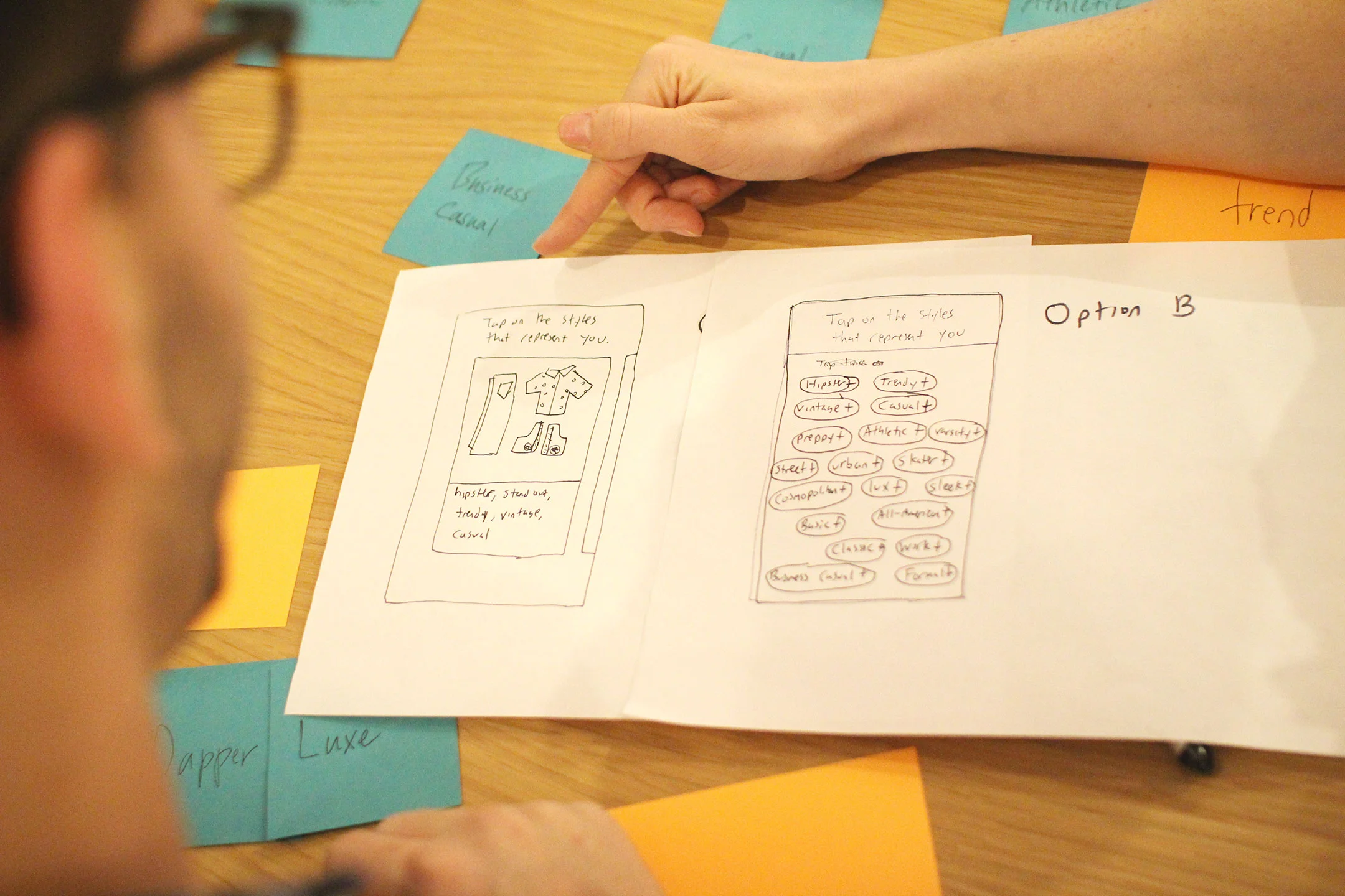
While card sorting we found that a few users were unfamiliar with many of the terms used to define style, or would define them differently. For instance, what some users defined as 'casual' others would describe as 'preppy'. We needed to know how to represent specific style categories so that they could be easily and accurately identified by our users. We wondered if it might be easier to use visuals rather than terms to represent different style categories. We sketched two paper prototypes of user interfaces for this part of the on-boarding. User's ultimately felt that using visual combinations (A) felt too restrictive compared to choosing individual terms (B).
KEY FINDINGS
Allow user to choose specific key terms - One type of user has a very particular style and wanted to choose individual key terms to properly define their style. He is uncomfortable choosing an overall term that generalized their style.
Provide user with options of popular overarching styles to choose from - Another type of user has an idea of his style but isn't familiar with and is overwhelmed by all of the sub-genres.
Create an algorithm within the app to improve the accuracy of the term definitions over time.
Design Strategy
FEATURE PRIORITIZATION
Where do we start? The MSCW method helped to prioritize features based on necessity and level of difficulty for both the users and the business. This would help us to focus on the base features that would be necessary to create a beta MVP which could be tested and developed further through future iterations.
User Flow
To understand what should go on each page and how the pages should flow together, we identified the primary goals of our users and created User Flows to map out the most efficient way to achieve that goal. In keeping with our scope, Curate's founders asked us to improve upon their current design. The flows below show how we were able to simplify the flow and make it a more pleasant experience.
Design Development
DESIGN STUDIO, HAND SKETCHING,WIREFRAMING (SKETCH), DIGITAL PROTOTYPING (INVISION, FLINTO), USABILITY TESTING
Referencing the newly created app map and our improved user flows, our team internally collaborated on rough sketches of each frame and began user testing with increasing fidelity along the way. After several rounds of usability testing with increasing fidelity, we arrived at an MVP for our client.


